Creating Mobile-Friendly Newsletters with LaunchMailTool's Responsive Design Templates

Creating Mobile-Friendly Newsletters with LaunchMailTool's Responsive Design Templates
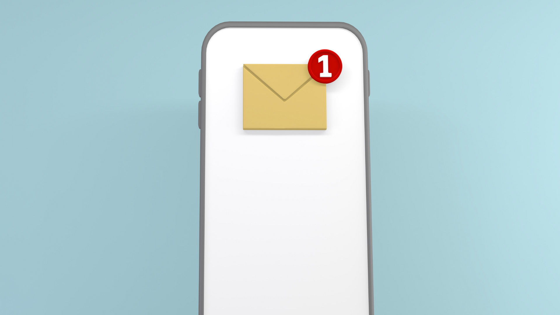
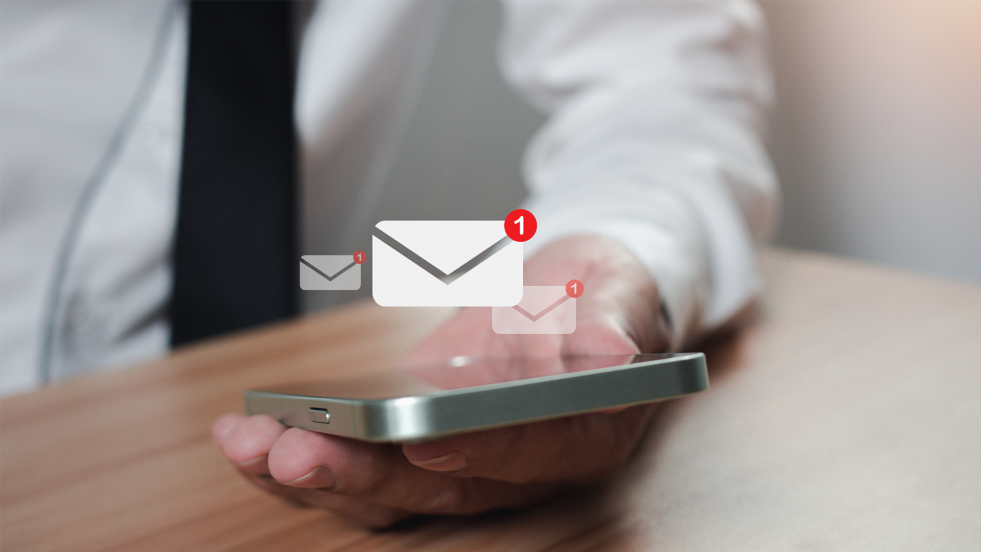
In today's fast-paced digital world, mobile devices have become the primary means of accessing emails. With an increasing number of people checking their emails on smartphones and tablets, it is crucial for businesses to optimize their newsletters for mobile devices. LaunchMailTool's responsive design templates offer a powerful solution to create mobile-friendly newsletters that capture the attention of mobile users, deliver a seamless reading experience, and maximize engagement.
Responsive design is an approach to web design that ensures the layout and content of a webpage adjust dynamically based on the screen size and orientation of the device being used. LaunchMailTool's responsive design templates incorporate this concept, enabling you to create newsletters that automatically adapt to different screen sizes, from desktop computers to smartphones. This ensures that your content looks visually appealing, remains readable, and maintains its effectiveness across a variety of devices.
One of the primary advantages of LaunchMailTool's responsive design templates is their ease of use. You don't need to have advanced coding skills or knowledge of web design to create mobile-friendly newsletters. The templates are pre-designed and optimized for responsiveness, allowing you to focus on the content and aesthetics of your newsletter. The intuitive drag-and-drop editor enables you to customize the templates, add images, format text, and include interactive elements without worrying about the technical aspects of responsive design.
Furthermore, LaunchMailTool's responsive design templates provide a seamless user experience. When recipients open your newsletters on their mobile devices, the templates automatically adjust the layout and content to fit the screen size. This eliminates the need for users to pinch and zoom or scroll horizontally, making it easy and convenient for them to read and interact with your newsletters. A seamless user experience translates to increased engagement and higher chances of your call-to-action being acted upon.
The responsive design templates also allow you to optimize your newsletters for mobile-specific features. For example, you can leverage the power of touchscreens by incorporating interactive elements such as buttons, sliders, or collapsible sections. These features enhance user engagement and provide a more interactive and immersive experience for mobile users. By utilizing the full potential of mobile devices, you can create newsletters that stand out and leave a lasting impression on your audience.
Another key advantage of LaunchMailTool's responsive design templates is improved deliverability. Email service providers increasingly prioritize mobile-friendly emails in their algorithms, ensuring that they are displayed prominently in recipients' inboxes. By using responsive design templates, your newsletters are more likely to pass through spam filters and reach your subscribers' primary inboxes, increasing the visibility and chances of engagement with your content.
Moreover, LaunchMailTool's responsive design templates offer a range of customization options. You can choose from a variety of layouts, color schemes, fonts, and styles to match your brand identity and create a visually appealing newsletter. Customization options enable you to create a unique and cohesive experience for your subscribers, strengthening brand recognition and building trust.
To further enhance the effectiveness of your mobile-friendly newsletters, LaunchMailTool's responsive design templates provide real-time previews. This feature allows you to see how your newsletters will appear on different devices before sending them out. You can test various screen sizes, including popular smartphones and tablets, to ensure that your newsletters look and function as intended. Real-time previews enable you to make necessary adjustments and optimizations, guaranteeing a seamless experience for your mobile audience.
In conclusion, LaunchMailTool's responsive design templates empower businesses to create mobile-friendly newsletters that captivate and engage their audience. With easy-to-use drag-and-drop functionality, seamless user experience, optimization for mobile-specific features, improved deliverability, customization options, and real-time previews, these templates offer a comprehensive solution to ensure that your newsletters look stunning and perform effectively across a wide range of devices. By leveraging the power of responsive design, you can enhance the impact of your newsletters, deliver a seamless reading experience, and maximize engagement with your mobile audience.